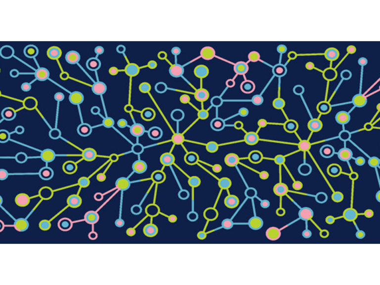

Recently I partnered with the talented data visualization whiz Shaelyn McCole of Santosha Creative to provide some analysis and visualizations on the success of a national charity event.
We wanted to provide our client with answers to questions such as… how much money can this event expect to raise in the coming years? Should we add more markets to the event calendar? What factors influence high fundraising?
YES, fun, we can do this, I thought! Then I saw the data – it was in aggregated report form, not raw – a true challenge for an analyst.
Persevering nevertheless, here is what we did:
– Using a couple key factors we did have available to us, we conservatively forecasted out expected fundraising growth over the next 2-3 years.
– We were able to comment on some key trends and insights hidden among the aggregated report – especially by visualizing data in a different light, new insights emerged.
– Luckily, we had enough historical data to cautiously comment on trends.
I ended up regretting my quick rush to judge this rich aggregated data. Lesson learned and happy client!
 Thanks for visiting FirstEval. Please reach out if you'd like to talk about your data.